
Ouzel
Identity and site, 2026
Ouzel runs as a DBA of TEC, and I designed the whole of it, the name, the logo, the type, thirteen rendered objects, an orbital map of the market and an authored scene at the foot of the page.
I pushed scholastic utopianism as far as it would go, because the agent space looks the same everywhere and a company nobody has heard of still has to look credible.
References
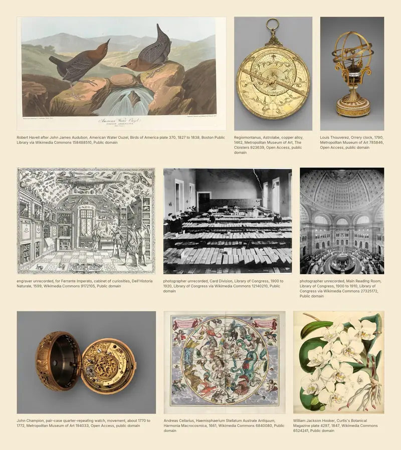
The mood board explains everything under it: the dipper, astrolabes and orreries, a cabinet of curiosities, a card catalog and an engraved plate. They share a nineteenth century confidence that the world can be cataloged, and the site borrows it wholesale.
The name
The name had to land with partners at major law firms, so I ran thousands of candidates myself. Ouzel won because John Muir wrote an essay on the water ouzel, so the identity had a bird and a piece of writing behind it before anything was drawn.
The brief
The words were settled before the design began, so every decision left happened inside what a visitor sees. The first build came back unclear and boring, and what I asked for next went the other way, heavy animation everywhere and an ouzel in water.
Scholastic utopianism
Scholastic utopianism sets knowledge out as treasure, the way DK Eyewitness lays out a page and the Nature Company dressed a store. TEC runs on the Nature Company half of it, so for Ouzel I dug into the DK Eyewitness half, heavy skeuomorphism and the maximalism of the early internet while it still believed in itself.
What I was reading
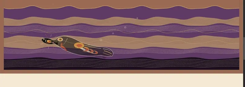
I spent part of this summer in San Francisco and Sonoma, reading Jack London and John Muir for a Mixmag feature I am writing on San Francisco. Muir's line about the hummingbird of blooming waters sits under the scene at the foot of the page, the only sentence added to the build.
Three channels
Objects modeled in Blender in the spirit of Myst drive one channel, geometry that nods at Northwest Coast formline the second, and color off 1960s psychedelic album art the third. With three channels moving at once the logo had to stay blank and stable.
Decisions
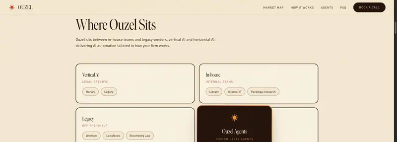
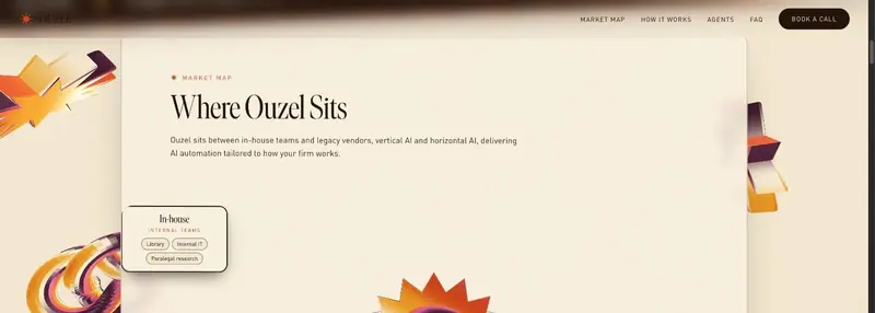
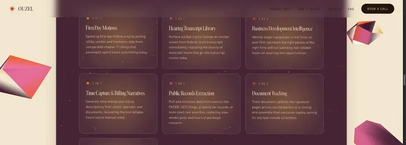
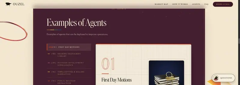
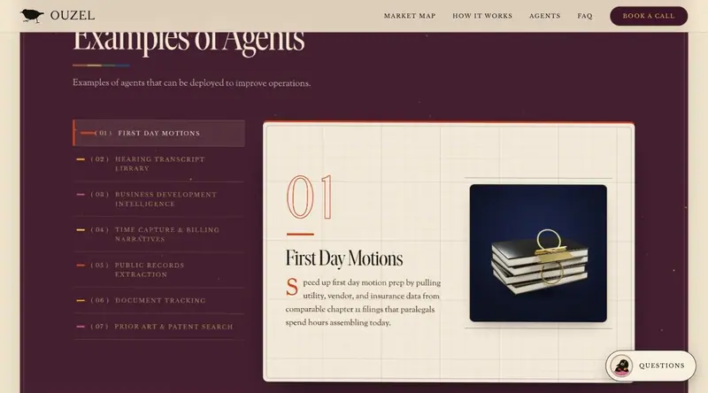
A flat two by two market map read as unclear and unimpressive and came back as an orbital diagram. Seven agent cards read as lazy and became a catalog of plates, and the static band at the foot became a scene where the bird dives, takes a fish and climbs into night.
The logo and the artwork
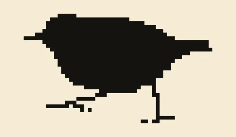
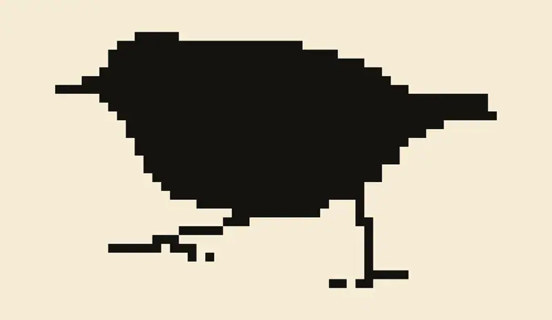
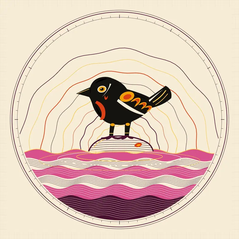
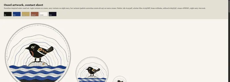
The illustrated roundel stood as the identity until late August, when a pixel version of the bird turned up on a poster and I made it the logo, encoded pixel for pixel at fifty by twenty nine off the source. Every placement lands on a whole multiple of that box, and the loader's breathing moved from a scale pulse to an opacity pulse because a fractional scale breaks square pixels.
The site
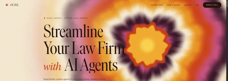
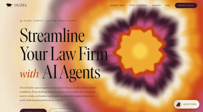
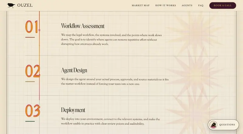
One page at tec.ltd/ouzel runs a hero on a shader, the orbital map, the catalog of plates, an animated process chain and the banner scene. Floating slabs sit over a three dimensional world, each one a plate on graph paper with a dateline in small caps, six of them numbered I to VI.
Type
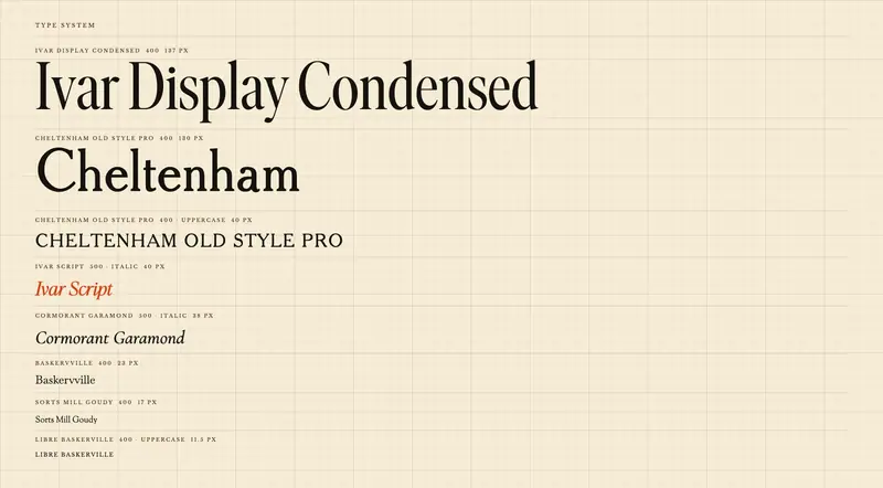
Ivar Display Condensed sets the display voice and Ivar Script the accent, with Cheltenham Old Style Pro, Sorts Mill Goudy and Libre Baskerville brought over from TEC so the two sites read as one studio.
Renders
I modeled and rendered thirteen objects headless in Blender, in antique brass and ink lacquer, and kept the generation script for every one. Each plate shows the object that depicts the work it describes, one to one, on one warm rig shared by all of them.
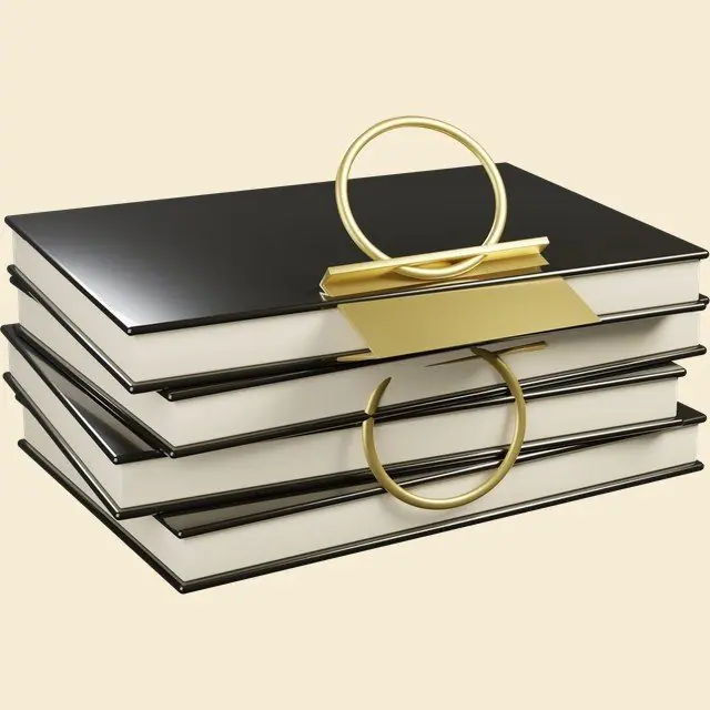
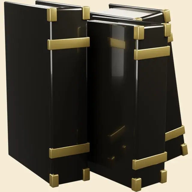
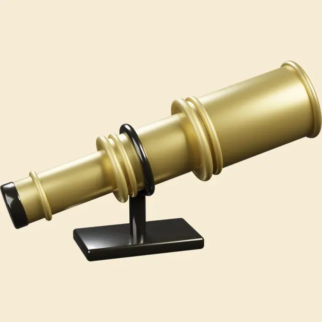
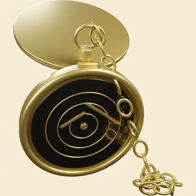
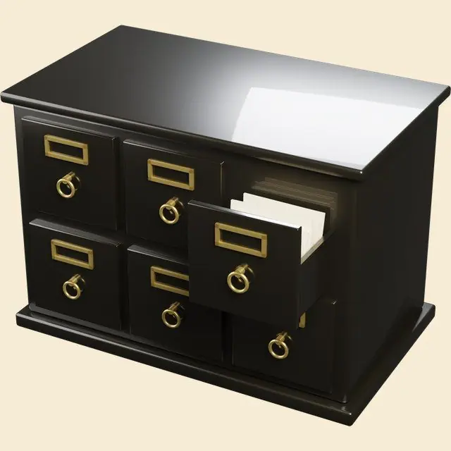
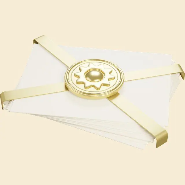
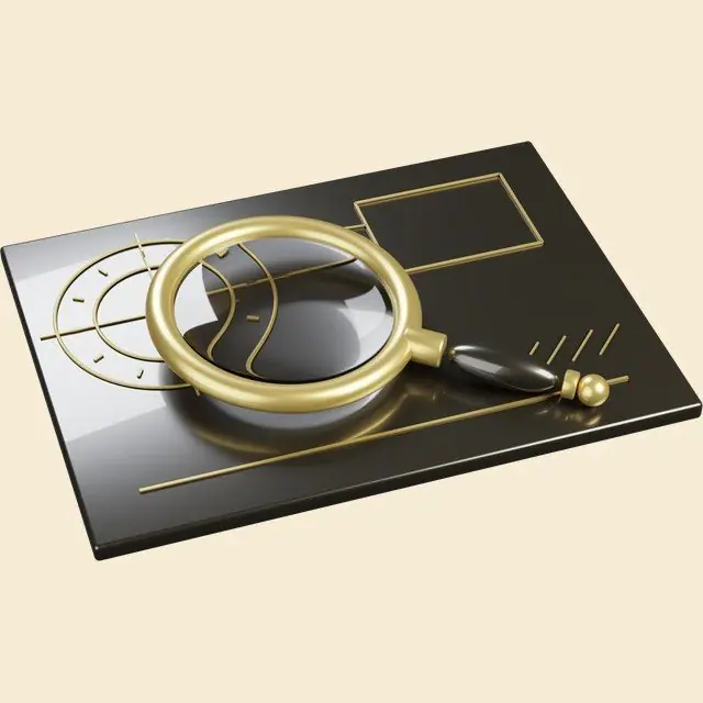
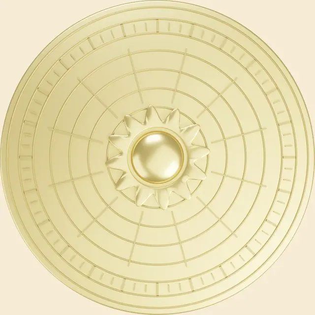
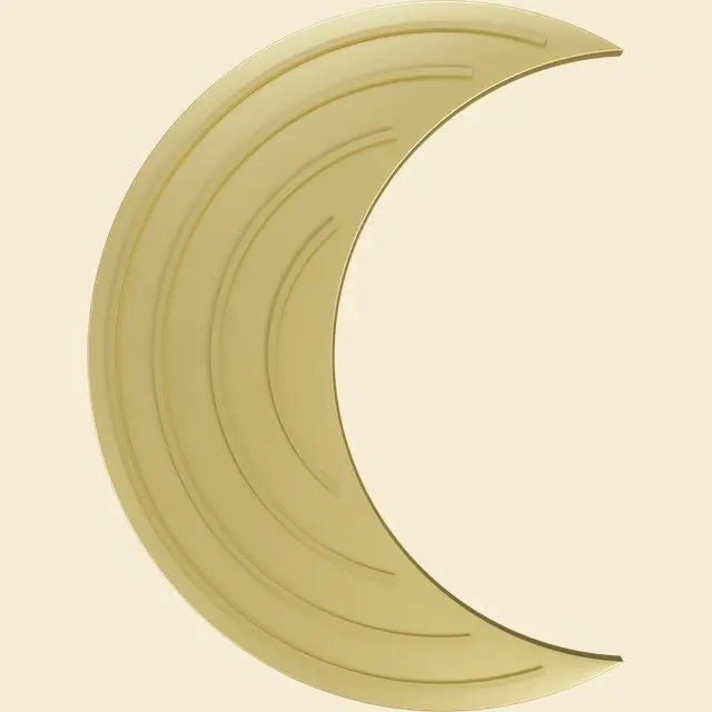

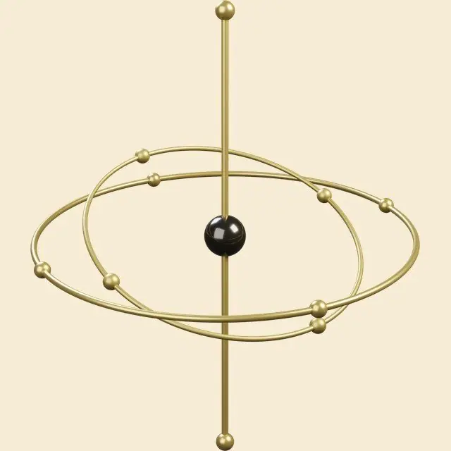
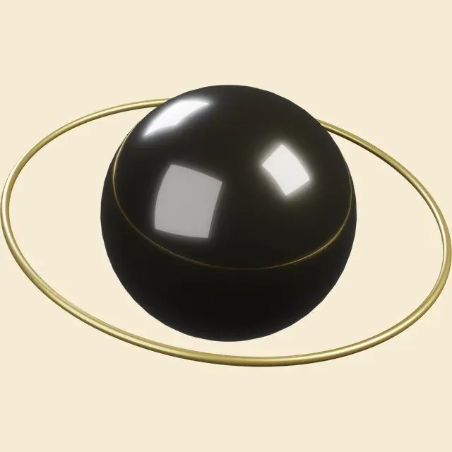

Thirteen objects already existed, so I wanted motion out of them and scripted it rather than keyframing by hand. The geometry gets solved in Python, where each object sits on the arc, how large it stands and when it arrives, a script writes those numbers into After Effects as keyframes, and the pictures render from the command line. The thirteen objects moving through it are the same Blender renders that sit on the catalog plates.
The mobile site
The first mobile build gray screened my iPhone, so phones now get exactly one WebGL context and everything else falls to CSS, SVG and 2D canvas. The orbit becomes a parchment orrery plate, four bodies turning on engraved rings, each one counter rotating so the object stays upright.
Result
The site runs live behind a password at tec.ltd/ouzel, still under construction, and the IP belongs to me. No traffic or enquiry figure exists for it, so I am claiming none.
Live sitetec.ltd/ouzel