

Love Fine Art
Identity and site, 2026
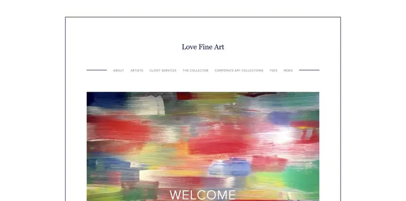
Love Fine Art, Inc. advises collectors out of Manhattan, and in July 2026 the firm hired me to rebuild a site that looked understated and sat inert.
I kept everything the firm already owned and raised its preppy register into an identity true to itself through small interventions, and what shipped runs in English, Arabic, and French on the firm's own domain.
References
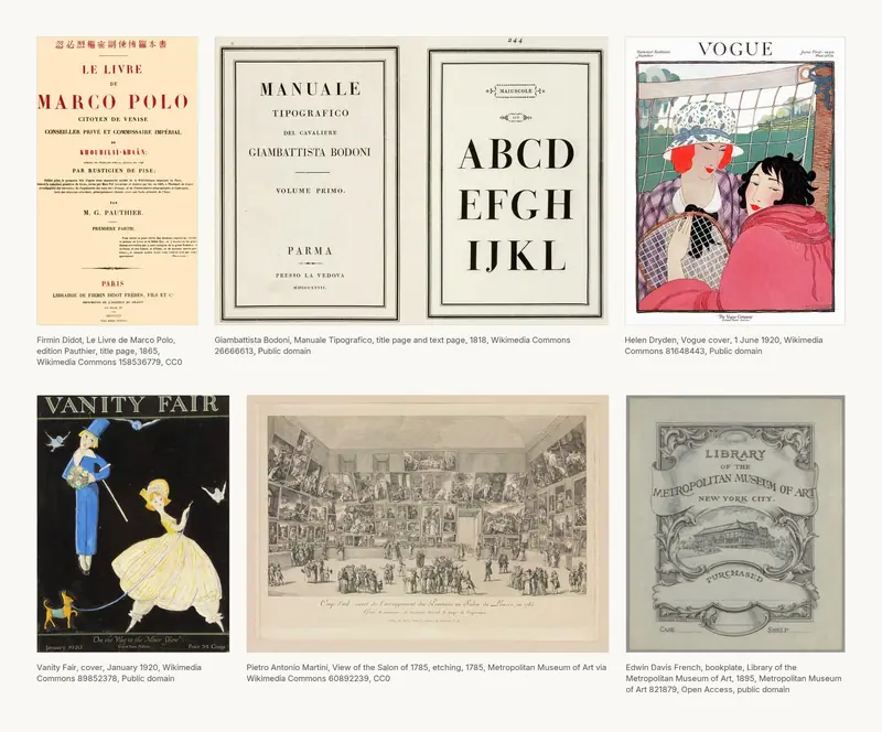
The mood board sets the register the firm had to stand in: Firmin Didot's own printing beside Bodoni's, two covers from 1920, a view of the Salon of 1785, and an engraved bookplate. Didot sets Vogue's pages, and through Vogue it stands for the New York art world of the eighties and nineties at its most high flying.
The brief
The firm came to me for a total rebuild. They pointed at more contemporary, of the moment work rather than a 2010 Squarespace site, so the brief settled as lifespan, animation, and movement, with less scrolling, rolling galleries, and the firm's L.L.Bean prep left intact.
The logo
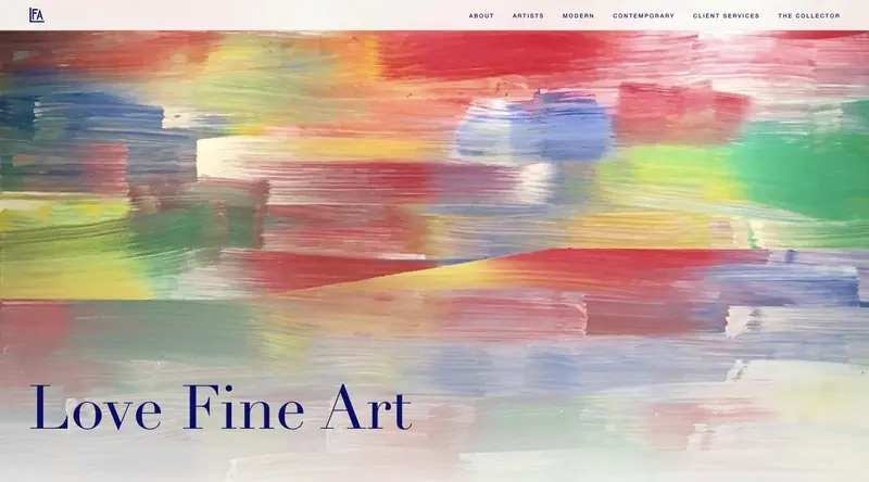
The firm already owned an architectural LFA monogram, and the only copy of it left anywhere was the 1300 pixel favicon on the old site. I traced that into three vector paths on a hundred unit grid, drawn inline so it takes the navy from the page, and its L became the operant device of the site, working as bullet, rule, and border.


Selected Works
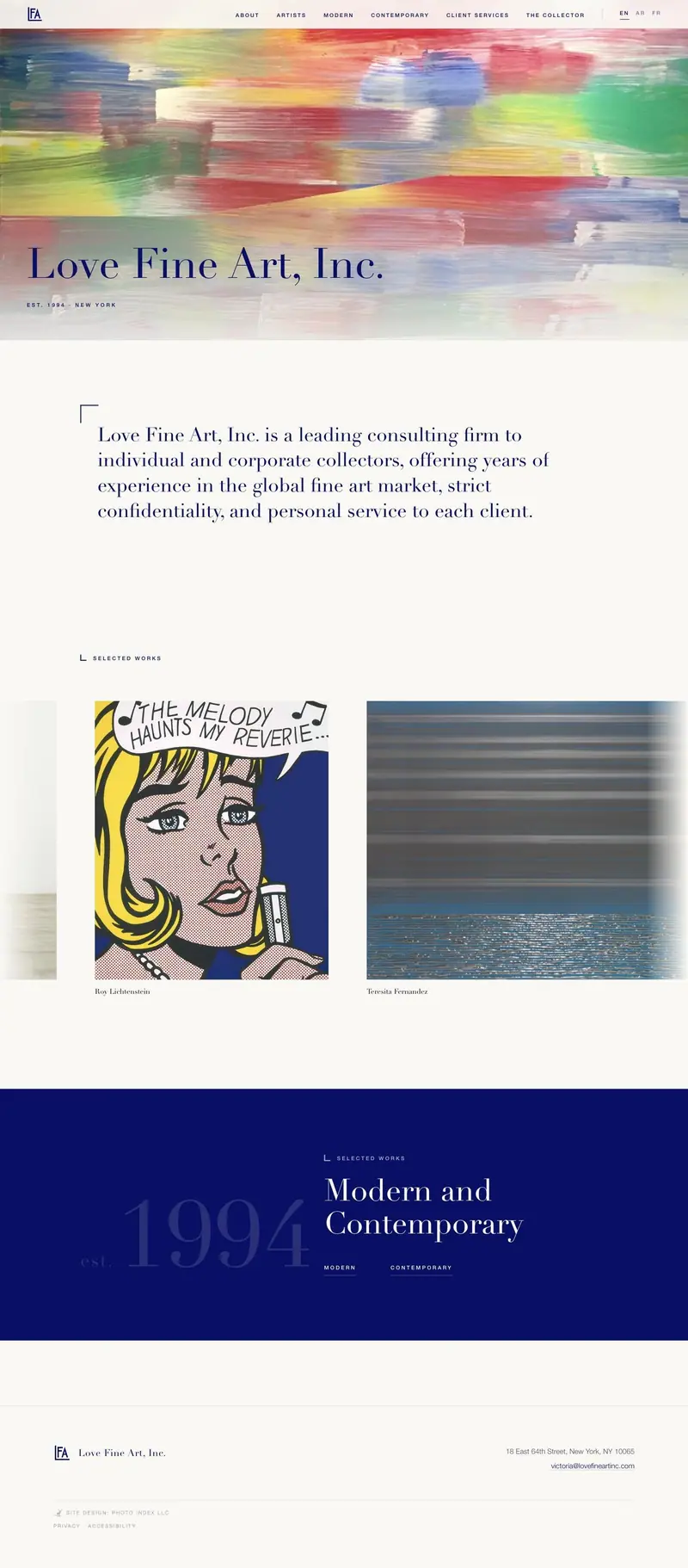
Love Fine Art, Inc. is a leading consulting firm to individual and corporate collectors, offering years of experience in the global fine art market, strict confidentiality, and personal service to each client.
Est. 1994 · New York
Type and palette
Didot sets the display and that one choice decides most of the identity, with Helvetica Neue under it and Libre Franklin self hosted so nobody lands on Arial. The navy, 061068, I picked off the client's own favicon rather than out of a swatch book, and it stays the only brand color, one full bleed band of it per page on warm paper.
Structure
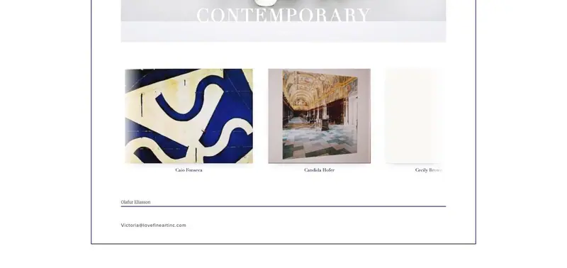
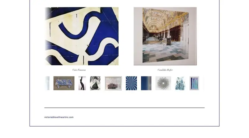
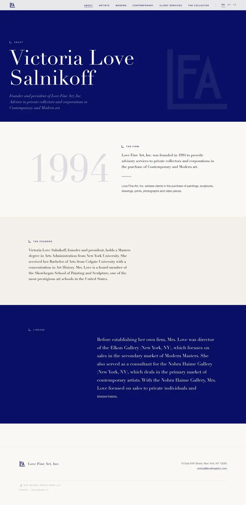
Every page opens at full height with the display type off center and the content under it itemized into ledgers, so a collector doing a credibility check can scan a page in one pass. Both gallery pages ran a static captioned grid and now run one rolling lane with every work in it, fifteen on Modern and thirty on Contemporary, nothing stranded at the bottom.
Motion
The rolls are tactile on purpose, like a turntable: they drift on their own, take a drag at one to one, and take momentum back into the drift when you let go. The illustration library runs to thirteen austere line drawings, each one drawing itself as you scroll past it, and reduced motion gets the whole site static and fully visible.
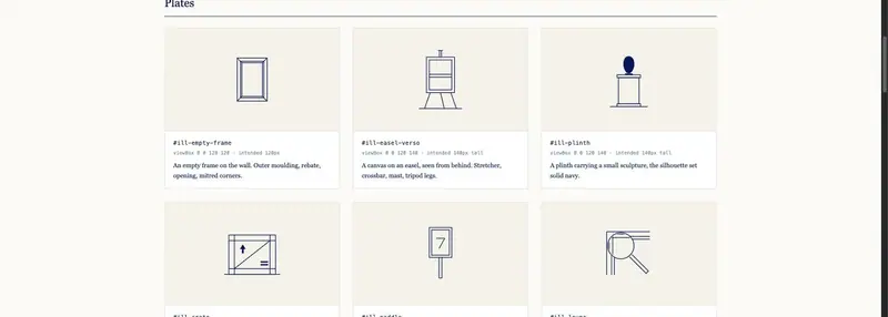
- Empty picture on a wall
- Canvas on an easel, verso
- Plinth with sculpture
- Shipping crate
- Auction paddle
- Conservator's loupe
- Picture light
- Hanging wire and hook
- Stacked leaning canvases
- Architectural doorway
- Museum bench
- 12px20px32px LFA L bracket
- Corner brackets
The site
The Squarespace code injection was a first crack at it, and it became clear that staying on Squarespace would be worse in every way. What shipped runs twenty seven pages across three editions, written by hand, one stylesheet, and no external request of any kind.
The mobile site
This is the mobile site. It distils everything above to the phone, the same pages and the same motion, with a centered two row lockup under 700 pixels and a full screen paper menu where script runs.


Three languages
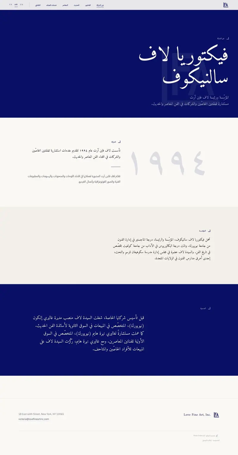
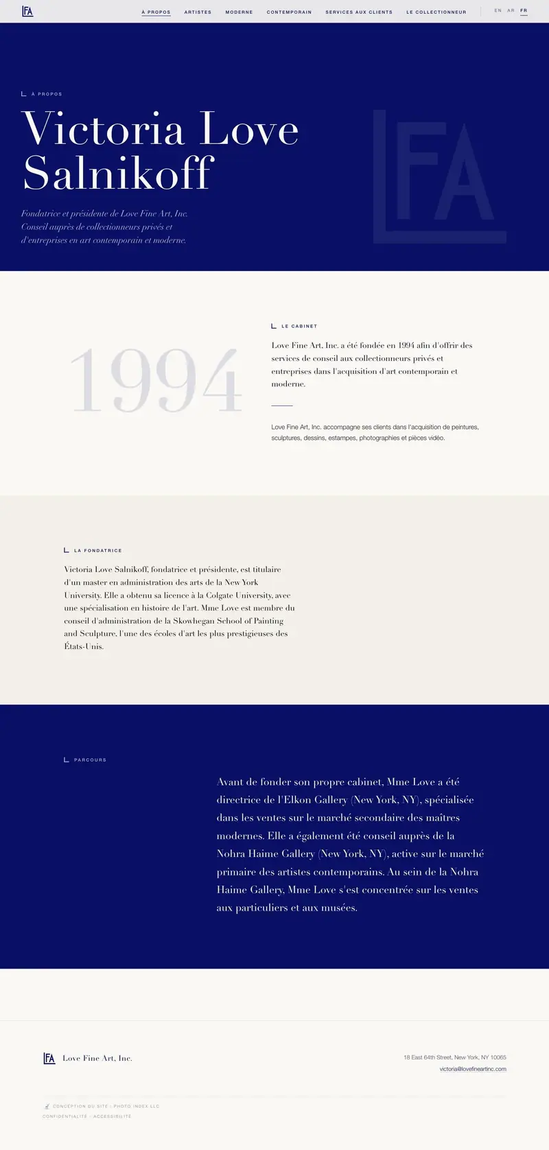
The client asked for the site again entirely in Arabic, then a French one, and a switcher at the top. Arabic runs Modern Standard right to left in Amiri and IBM Plex Sans Arabic with Arabic-Indic numerals, and the best moment on the whole site sits there, where the text crosses the monogram.
Result
Twenty seven pages went live at lovefineartinc.com on July 23, 2026, off Squarespace and onto a static build at the firm's own domain, with the registrar left where it was and every mail record untouched. I host it now, the firm saves money every month, and it is a better site.
Live sitelovefineartinc.com